If we have large data we cannot analyze each and every value so we calculate the average of the total data. To know how data is changing like increase or decrease we have to plot a graph to understand it and again you cannot plot the whole data. pandas provides plotting your data out of the box, using the power of Matplotlib. You can pick the plot type (scatter, bar, boxplot,…) corresponding to your data.
In [1]: importpandasaspdIn [2]: importmatplotlib.pyplotasplt
Data used for this tutorial :
For this tutorial, air quality data about NO2 is used, made available by openaq, and using the py-openaq package. The air_quality_no2.csv data set provides NO2 values for the measurement stations FR04014, BETR801, and London Westminster in respectively Paris, Antwerp, and London. Download the data by clicking the button Link Button
Now we have the data we should plot the data now.To have a quick visual check data
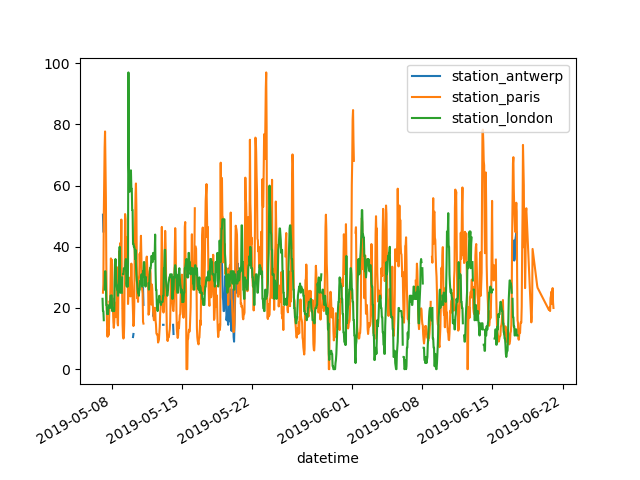
>>>air_quality.plot() <matplotlib.axes._subplots.AxesSubplot at 0x7fbbf7dced30>
We now not used Matplotlib module by default pandas DataFrame will create a plot for each of the columns with the numeric data.
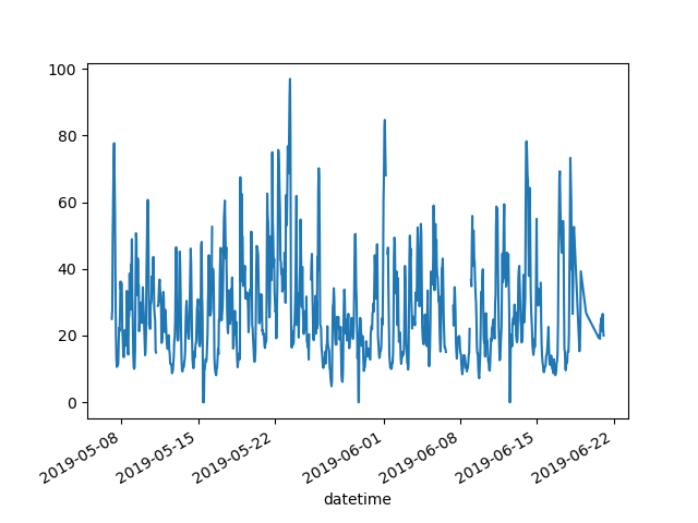
>>>air_quality["station_paris"].plot()
<matplotlib.axes._subplots.AxesSubplot at 0x7fbbf7dced30>
Till now the plots are made by the pandas module. To do these basic plotting you can use pandas plot method.
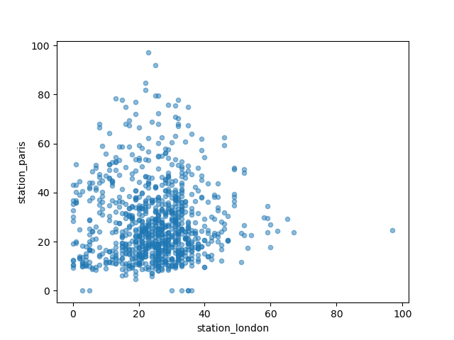
I want to visually compare the N02 values measured in London versus Paris.
In [7]: air_quality.plot.scatter(x="station_london",
   ...:                          y="station_paris",
   ...:                          alpha=0.5)
   ...:
Out[7]: <matplotlib.axes._subplots.AxesSubplot at 0x7f534481f710>
Apart from the default line the plot when using the plot function, a number of alternatives are available to plot data. Let’s use some standard Python to get an overview of the available plot methods:
In many development environments as well as ipython and jupyter notebook, use the TAB button to get an overview of the available methods, for example air_quality.plot. + TAB.
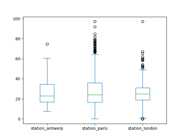
One of the options is DataFrame.plot.box(), which refers to a boxplot. The box method is applicable on the air quality example data:
In [9]: air_quality.plot.box()Out[9]: <matplotlib.axes._subplots.AxesSubplot at 0x7f5344381810>
To user guide
For an introduction to plots other than the default line plot, see the user guide section about supported plot styles.
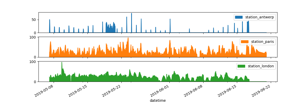
I want each of the columns in a separate subplot.
In [10]: axs=air_quality.plot.area(figsize=(12,4),subplots=True)
Separate subplots for each of the data columns is supported by the subplots argument of the plot functions. The builtin options available in each of the pandas plot functions that are worthwhile to have a look.
To user guide
Some more formatting options are explained in the user guide section on plot formatting.
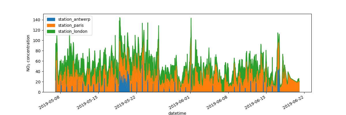
I want to further customize, extend or save the resulting plot.
In [11]: fig,axs=plt.subplots(figsize=(12,4));In [12]: air_quality.plot.area(ax=axs);In [13]: axs.set_ylabel("NO$_2$ concentration");In [14]: fig.savefig("no2_concentrations.png")
Each of the plot objects created by pandas are a matplotlib object. As Matplotlib provides plenty of options to customize plots, making the link between pandas and Matplotlib explicit enables all the power of matplotlib to the plot. This strategy is applied in the previous example:
fig,axs=plt.subplots(figsize=(12,4))# Create an empty matplotlib Figure and Axesair_quality.plot.area(ax=axs)# Use pandas to put the area plot on the prepared Figure/Axesaxs.set_ylabel("NO$_2$ concentration")# Do any matplotlib customization you likefig.savefig("no2_concentrations.png")# Save the Figure/Axes using the existing matplotlib method.
REMEMBER
The .plot.* methods are applicable on both Series and DataFrames
By default, each of the columns is plotted as a different element (line, boxplot,…)
Any plot created by pandas is a Matplotlib object.


No comments